A Cause and Effect Diagram, also known as a Fishbone Diagram or Ishikawa Diagram, is a powerful tool used for identifying the root causes of a problem. It is widely employed in various industries to analyze processes, improve quality, and foster a structured approach to problem-solving. By visually organizing potential causes into categories, this tool enables teams to pinpoint areas for improvement systematically. Below is an in-depth look at creating and utilizing a Cause and Effect Diagram effectively.
1. What is a Cause and Effect Diagram?
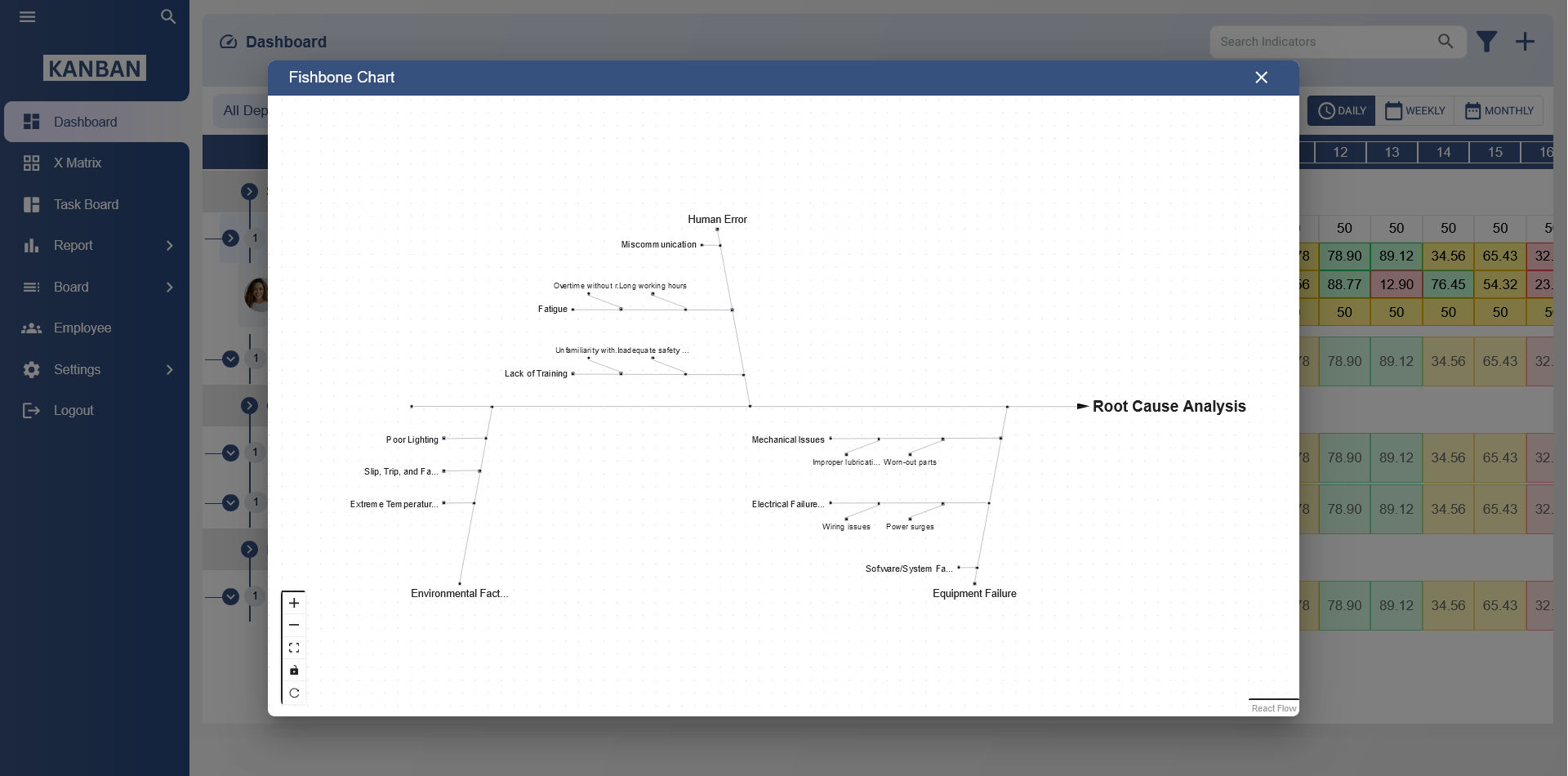
The Cause and Effect Diagram is a visual representation that helps identify the relationships between a problem (effect) and its possible causes. The "head" of the diagram represents the problem or effect, while the "bones" or "branches" illustrate categories of potential causes. This structured approach simplifies the identification of issues that may otherwise remain hidden in complex processes.
2. Benefits of Using a Cause and Effect Diagram
- Improves problem-solving: Encourages a systematic approach to identifying root causes.
- Enhances team collaboration: Facilitates brainstorming sessions where diverse perspectives are shared.
- Streamlines process improvement: Highlights inefficiencies or gaps in workflows.
- Boosts clarity: Provides a clear, visual depiction of potential issues and their interconnections.
3. Steps to Create a Cause and Effect Diagram
Follow these steps to develop an effective Cause and Effect Diagram:
Step 1: Define the Problem
Clearly articulate the problem or effect you are addressing. Write this in a box at the "head" of the diagram. For instance, if your team is facing delays in product delivery, the problem statement could be "Delayed Product Delivery."
Step 2: Identify Main Categories
Determine the broad categories of causes that could contribute to the problem. Common categories include:
- People: Human factors such as training, skills, or communication.
- Processes: Procedural or workflow-related issues.
- Materials: Quality, availability, or suitability of materials used.
- Environment: External conditions, physical or organizational settings.
- Methods: Techniques or methodologies applied to complete tasks.
- Equipment: Tools, machinery, or technology used in the process.
These categories form the main branches of your diagram.
Step 3: Brainstorm Specific Causes
Within each category, list specific causes that could contribute to the problem. For example:
- People: Lack of training, insufficient staffing, or unclear roles.
- Processes: Inefficient workflows, lack of standardization, or delays in approvals.
- Materials: Poor quality materials or supplier issues.
Connect these sub-causes to the appropriate branches in your diagram.
Step 4: Analyze and Prioritize Causes
Review the diagram to identify the most likely root causes. Use data or additional research to validate your findings. Prioritize the causes that require immediate attention based on their impact on the problem.
Step 5: Develop Solutions
Once root causes are identified, collaborate with your team to propose actionable solutions. For example, if "lack of training" is a key cause, implement a comprehensive training program to address the gap.
4. Example Cause and Effect Diagram
Let’s consider an example for a manufacturing company facing frequent equipment breakdowns:
Problem:
Frequent Equipment Breakdowns
Categories:
- People: Insufficient training, lack of maintenance staff.
- Processes: Irregular maintenance schedules, lack of standard operating procedures.
- Equipment: Aging machinery, inadequate repairs.
- Environment: Dusty or humid conditions causing wear and tear.
This diagram would visually display each category and sub-cause, helping the team to address the specific issues leading to breakdowns.
5. Tips for Effective Use
- Collaborate with stakeholders: Involve team members from different departments to gather diverse insights.
- Use real data: Base your analysis on actual data to avoid assumptions.
- Keep it simple: Focus on the most impactful causes to avoid cluttering the diagram.
- Update regularly: Review and revise the diagram as processes and challenges evolve.
6. Advantages in Various Industries
The Cause and Effect Diagram is versatile and applicable across industries, including:
- Manufacturing: Identifying defects or inefficiencies in production processes.
- Healthcare: Analyzing patient care issues or operational delays.
- IT: Diagnosing system failures or performance bottlenecks.
- Education: Addressing learning gaps or student performance issues.
Cause and Effect Diagram Template
What is a Cause and Effect Diagram template?
A Cause and Effect Diagram template, also known as a Fishbone or Ishikawa diagram, is a tool used to systematically identify and analyze potential causes of a specific problem or effect.
How does a Cause and Effect Diagram work?
A Cause and Effect Diagram works by categorizing potential causes into groups and displaying them as branches from a central "spine" that represents the main problem or effect. It visually organizes contributing factors for analysis.
What are the key components of a Cause and Effect Diagram?
The key components include the main "spine" for the effect or problem, primary "branches" representing major categories, and smaller "twigs" indicating specific causes within each category.
When should you use a Cause and Effect Diagram?
A Cause and Effect Diagram is best used during the problem-solving process, especially in the root cause analysis phase, to uncover all possible causes contributing to a problem.
How do you create a Cause and Effect Diagram?
To create a Cause and Effect Diagram, start by writing the problem or effect at the head of the diagram. Draw a horizontal line (spine) and add branches for categories such as People, Process, Equipment, and Materials. Then, list specific causes under each category.
What are the benefits of using a Cause and Effect Diagram?
The benefits include organizing potential causes systematically, facilitating team collaboration, identifying root causes, and providing a visual aid for problem-solving and process improvement.
How does a Cause and Effect Diagram aid in root cause analysis?
By breaking down a problem into categories and listing potential causes, the diagram helps teams systematically investigate and pinpoint the root cause of the issue.
What categories can be used in a Cause and Effect Diagram?
Common categories include People, Process, Equipment, Materials, Environment, and Management. However, the categories can be customized based on the problem being analyzed.
Can a Cause and Effect Diagram improve team collaboration?
Yes, creating a Cause and Effect Diagram encourages team members to contribute their insights, fostering collaboration and ensuring that diverse perspectives are considered in the analysis.
How do you prioritize issues in a Cause and Effect Diagram?
Issues can be prioritized by evaluating their impact on the problem and frequency of occurrence. Teams may use voting or data analysis to focus on the most critical causes.
Is a Cause and Effect Diagram suitable for every type of problem?
While versatile, the diagram is most effective for complex problems with multiple contributing factors. It may not be necessary for simple or straightforward issues.
What industries commonly use Cause and Effect Diagrams?
Industries such as manufacturing, healthcare, software development, and education commonly use these diagrams for quality control, process improvement, and problem-solving.
Can a Cause and Effect Diagram be created digitally?
Yes, many tools and software options allow for creating digital Cause and Effect Diagrams, making it easier to share and edit collaboratively.
How does a Cause and Effect Diagram support continuous improvement?
By identifying root causes and facilitating solutions, the diagram helps improve processes over time. Teams can revisit the diagram to refine and address emerging issues.
What are common mistakes to avoid when using a Cause and Effect Diagram?
Common mistakes include oversimplifying the analysis, not involving the right team members, failing to prioritize causes, and neglecting to validate findings with data.