The Kanban board is a powerful tool used in workflow management, particularly in project management and production environments. It helps visualize the flow of tasks through various stages, from "To Do" to "Completed." A critical element of this tool is the Burndown Chart, which provides a visual representation of work completed versus work remaining over time. The combination of these two elements—Kanban boards and Burndown Charts—offers an effective way to track progress, predict project completion, and ensure that teams stay on track with their goals.
What is a Kanban Board?
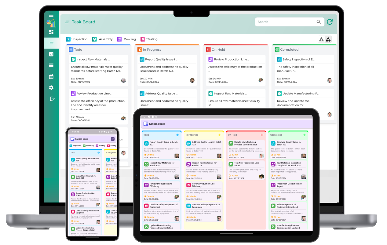
A Kanban board is a visual tool that helps manage workflow by using columns to represent different stages of a process. The board consists of multiple columns that typically include stages such as "Backlog," "To Do," "In Progress," and "Completed." Each task or work item is represented by a card, which moves through the columns as work progresses. The Kanban board is based on principles that prioritize efficiency, transparency, and continuous improvement.
The Role of a Burndown Chart in Kanban
The Burndown Chart is an essential part of tracking progress in Kanban workflows. It helps visualize the amount of work completed versus the remaining work, providing insight into the pace at which tasks are being finished. In a Burndown Chart, time is plotted along the x-axis, and the amount of work (typically measured in task units or story points) is plotted along the y-axis. The chart visually "burns down" as tasks are completed, ideally approaching zero work remaining as the deadline or sprint end nears.
Key Elements of a Kanban Board Burndown Chart
1. Time (X-Axis)
Time is represented on the x-axis of the Burndown Chart, typically divided into days, weeks, or sprints, depending on the length of the project or cycle being tracked. The timeline helps to gauge progress over time, showing how much work remains at any given point during the project. The time period is crucial for understanding if the team is on track to complete the tasks within the allocated time frame.
2. Work Remaining (Y-Axis)
The amount of work remaining is plotted on the y-axis. Work can be measured in various units, such as task points, hours, or the number of tasks. The measurement chosen depends on the nature of the project or the team’s workflow preferences. The key is consistency—work remaining must be consistently tracked in the same way for each task to ensure an accurate chart.
3. Ideal Work Line
The ideal work line represents the rate at which work should be completed to meet the deadline. This line is usually a straight diagonal line that starts at the top of the y-axis (maximum work remaining) and gradually slopes down to zero work remaining by the end of the project timeline. It provides a benchmark for the team to assess if they are on track or if there are delays that need to be addressed.
4. Actual Burndown Line
The actual burndown line shows the real-time progress of the team, illustrating the amount of work that has been completed and how much remains. Unlike the ideal work line, the actual burndown line will fluctuate based on the team's productivity and potential disruptions in the workflow. The actual burndown line helps teams assess their performance and make necessary adjustments if they are falling behind schedule.
5. Remaining Work Data
At each point in time, the remaining work is recorded and updated in the Burndown Chart. This data is critical for understanding how quickly tasks are being completed and how much work is left. By continuously updating this information, the chart provides real-time insights into the project’s progress and potential issues that need to be addressed, such as bottlenecks or delays.
6. Milestones and Key Events
Milestones or key events are often marked on the Burndown Chart to highlight significant points in the project. These may include deadlines, major task completions, or other significant achievements in the workflow. Adding milestones helps provide context to the chart, allowing teams to see how their progress aligns with key project deliverables and objectives.
7. Adjustments and Buffer Time
In Kanban, flexibility is crucial, and the Burndown Chart often reflects adjustments made to the timeline, scope, or priorities. If there is a delay in completing tasks, additional buffer time may be added to the timeline. This ensures that the team’s progress is still measurable, even if external factors affect the work pace. Buffer time can help teams adapt to unexpected disruptions, such as resource shortages or unforeseen complications, without drastically altering the chart’s integrity.
How to Use the Kanban Board Burndown Chart Effectively
1. Regular Updates
To ensure the Burndown Chart reflects accurate progress, it is important to update it regularly. Whether done daily or at the end of each work session, these updates keep the chart current and provide real-time insights. Teams should update the work remaining data after completing tasks or identifying new work. Regular updates ensure that any changes in the project or workload are captured in the chart, giving teams a clearer picture of their progress.
2. Monitor Trends
By regularly reviewing the Burndown Chart, teams can identify trends in their progress. If the actual burndown line is consistently above the ideal work line, it may indicate that the team is falling behind and needs to accelerate their efforts or address obstacles. On the other hand, if the actual burndown line is consistently below the ideal work line, it could suggest that the team is completing tasks faster than expected, which might indicate overcapacity or resource misallocation.
3. Use the Chart for Communication
The Burndown Chart is not only a tool for team members but also serves as a communication tool for stakeholders. By providing a visual representation of progress, teams can effectively communicate the status of the project to stakeholders and managers, making it easier for them to understand the current state and any potential risks. It also helps foster transparency in the project, as everyone involved can easily see how the team is progressing.
4. Analyze Bottlenecks
The Burndown Chart can be used to identify bottlenecks or delays in the workflow. If the chart shows that the actual burndown line is flat or slow over an extended period, it could indicate that certain tasks are taking longer than anticipated. This is an opportunity for teams to analyze the root cause of the bottleneck and make necessary adjustments to improve the workflow and get back on track.
Benefits of Using the Kanban Board Burndown Chart
Using the Burndown Chart with a Kanban board offers several advantages:
- Improved Visibility: The Burndown Chart provides clear visibility into the progress of work and helps teams track the completion of tasks over time.
- Enhanced Accountability: With regular updates, team members become more accountable for completing their tasks within the designated time frame.
- Proactive Problem Solving: The chart helps identify potential issues early, allowing teams to address challenges before they become critical problems.
- Efficient Communication: The visual nature of the chart makes it easy to communicate progress to stakeholders and other team members.
- Data-Driven Decision Making: By analyzing trends in the Burndown Chart, teams can make informed decisions to adjust the project plan or workflow as needed.
Elements of Kanban board burndown chart
What is a Kanban board burndown chart?
A Kanban board burndown chart is a visual tool used to track the progress of work items over time. It shows how much work remains to be completed in relation to time, allowing teams to monitor their performance and progress toward completing tasks.
What are the main elements of a Kanban board burndown chart?
The main elements of a Kanban board burndown chart include the X-axis (time), Y-axis (work items remaining), the actual line (representing progress), and a target line (which shows the expected progress over time).
How does a Kanban board burndown chart track progress?
The burndown chart tracks progress by showing how many work items are left to complete over time. As tasks are completed and moved across the Kanban board, the remaining work decreases, which is represented by the burndown line.
What is the purpose of the burndown chart in Kanban?
The purpose of the burndown chart in Kanban is to provide a visual representation of progress over time, helping teams identify any issues with the workflow, potential bottlenecks, and whether they are on track to meet their goals.
How is a Kanban burndown chart different from other types of burndown charts?
A Kanban burndown chart differs from others as it focuses on work items and their progress through the workflow stages. Unlike Scrum burndown charts, which track tasks versus time, Kanban charts track work items versus time, offering flexibility in the number of tasks being processed.
What does the X-axis represent in a Kanban board burndown chart?
The X-axis in a Kanban board burndown chart represents time. This could be tracked over days, weeks, or any other time unit, depending on the scale of the project or sprint.
What does the Y-axis represent in a Kanban board burndown chart?
The Y-axis in a Kanban board burndown chart represents the total number of work items or tasks that remain to be completed. It shows how many tasks are still in the backlog or in progress at any given time.
How do work items appear in a Kanban board burndown chart?
Work items are plotted as a cumulative total on the Y-axis, with the line representing the number of tasks remaining over time. As tasks are completed, the line moves downward, showing progress toward completion.
How is a burndown chart used to monitor work-in-progress?
A burndown chart monitors work-in-progress by showing the remaining tasks over time. It helps identify if work is being completed at a steady pace and if there are any delays or bottlenecks in the workflow.
Can a Kanban burndown chart be used for multiple teams?
Yes, a Kanban burndown chart can be used for multiple teams by aggregating the progress of all teams and displaying their combined progress toward shared goals or separate progress for individual teams.
How does a Kanban board burndown chart help in managing deadlines?
A Kanban board burndown chart helps manage deadlines by visually tracking the progress of tasks and work items. It provides insights into whether a team is on schedule to complete the tasks before the deadline or if corrective actions are needed.
How do you interpret a flat line in a Kanban burndown chart?
A flat line in a Kanban burndown chart indicates that no progress is being made. This could be due to a bottleneck, a pause in the workflow, or a problem preventing tasks from moving through the Kanban system.
What actions should be taken if a Kanban board burndown chart shows a rising line?
If a Kanban board burndown chart shows a rising line, it indicates that the team is falling behind and work is accumulating. This may require investigating workflow issues, addressing bottlenecks, or reallocating resources to get back on track.
How can a Kanban board burndown chart contribute to process improvements?
A Kanban board burndown chart contributes to process improvements by highlighting inefficiencies and bottlenecks in the workflow. It allows teams to identify trends, make data-driven decisions, and implement changes that improve performance and workflow efficiency.
How often should a Kanban burndown chart be updated?
A Kanban burndown chart should be updated regularly, typically at the end of each workday or whenever a significant milestone or change occurs in the workflow, to ensure that the progress is tracked in real-time.