The Balanced Scorecard (BSC) is a strategic management tool that helps organizations translate their vision and strategy into a coherent set of performance measures. It provides a holistic view of an organization's performance, breaking it down into four key perspectives: financial, customer, internal processes, and learning and growth. When combined with visual insights, the Balanced Scorecard becomes even more powerful, offering a clear and intuitive way to monitor and communicate performance across all areas of the business.
1. Overview of the Balanced scorecard
The Balanced Scorecard was developed by Robert Kaplan and David Norton in the early 1990s to provide a more comprehensive view of an organization's performance beyond traditional financial measures. It includes four key perspectives:
- Financial Perspective: Focuses on the financial objectives of an organization, such as profitability, revenue growth, and cost management.
- Customer Perspective: Focuses on customer satisfaction, retention, and market share.
- Internal Process Perspective: Examines the efficiency and effectiveness of internal processes that create value for the customer.
- Learning and Growth Perspective: Focuses on developing organizational capabilities, such as employee skills, technology, and innovation.
The BSC enables businesses to align their goals across all four perspectives, ensuring that each department and individual contributes to the broader organizational strategy. By using a mix of leading and lagging indicators, organizations can track their progress towards their strategic goals, identify potential risks, and make data-driven decisions.
2. Visual Insights in Performance Management
Visual insights are an essential tool in performance management because they make complex data easier to understand and interpret. They help organizations move beyond raw data and create meaningful visual representations of performance that can be easily communicated to stakeholders. These insights can be in the form of charts, graphs, dashboards, and heat maps that provide real-time feedback on performance across different areas of the business.
When paired with the Balanced Scorecard, visual insights enhance decision-making by providing an intuitive way to monitor performance and identify trends. By visualizing performance data, organizations can easily pinpoint areas that require attention and track the progress of strategic initiatives. This makes it easier for managers and executives to make informed decisions and take corrective actions as needed.
3. How Visual Insights Enhance the Balanced scorecard
Integrating visual insights with the Balanced Scorecard creates a powerful combination that enables organizations to track performance in real-time and across multiple dimensions. Here's how visual insights can enhance the Balanced Scorecard:
- Real-Time Data Tracking: Visual insights allow for the real-time tracking of performance indicators. This means that executives can get an up-to-date snapshot of the organization's progress towards its goals without needing to sift through complex reports.
- Improved Decision-Making: Visual representations of performance data make it easier for decision-makers to spot trends, identify potential issues, and make data-driven decisions. They can instantly see which areas are performing well and which need improvement.
- Better Communication: Visual insights make it easier to communicate performance data to different stakeholders, whether they are employees, customers, or investors. Dashboards and visual reports make complex information more accessible and understandable.
- Enhanced Collaboration: Visual insights help foster collaboration between departments by showing how each department's performance impacts the broader organizational goals. This creates a sense of shared ownership and accountability for the organization's success.
- Increased Transparency: By visualizing performance, organizations create a transparent environment where progress towards strategic goals is visible to all levels of the organization. This encourages alignment and accountability.
4. Implementing the Balanced Scorecard with Visual Insights
To successfully implement the Balanced Scorecard with visual insights, organizations need to follow a few key steps:
- Define Strategic Goals: The first step in implementing a Balanced Scorecard is to clearly define the organization's strategic goals. These goals should align with the organization's vision and mission and provide a roadmap for success.
- Identify Key Performance Indicators (KPIs): Once the strategic goals are defined, organizations need to identify the KPIs that will help them measure progress towards those goals. These KPIs should be specific, measurable, achievable, relevant, and time-bound (SMART).
- Design Visual Dashboards: Visual dashboards are a critical part of the process. They should be designed to display the most important KPIs across all four Balanced Scorecard perspectives. Dashboards should be user-friendly and allow stakeholders to easily see how they are performing against their goals.
- Integrate Data Sources: To ensure that the data is accurate and up-to-date, organizations need to integrate data from different sources, such as financial systems, customer databases, and HR systems. This ensures that the visual insights reflect the true state of the business.
- Monitor and Adjust: Regular monitoring of the Balanced Scorecard and visual insights is essential for tracking progress and making adjustments as needed. Organizations should conduct regular reviews to assess the effectiveness of their strategy and make any necessary changes to their goals or KPIs.
5. Benefits of Combining Balanced scorecard with Visual Insights
Combining the Balanced Scorecard with visual insights provides several benefits:
- Holistic View of Performance: The Balanced Scorecard provides a comprehensive view of organizational performance across multiple dimensions. By adding visual insights, organizations can gain a clearer, more intuitive understanding of how each area of the business is performing.
- Increased Accountability: Visual insights help make performance data more transparent, encouraging accountability at all levels of the organization. Employees can see how their efforts contribute to the organization's overall success.
- Improved Strategic Alignment: By visualizing performance against strategic goals, organizations can ensure that all departments and employees are aligned with the company's mission and vision. This alignment helps drive organizational success.
- Faster Decision-Making: With real-time visual insights, executives and managers can make faster, more informed decisions. This leads to a more agile organization that can quickly respond to changes in the business environment.
Balanced scorecard and Visual Insights
What is the balanced scorecard and how does it provide visual insights?
The balanced scorecard is a strategic management tool used to track organizational performance across four perspectives: financial, customer, internal processes, and learning & growth. Visual insights in a balanced scorecard involve the use of graphs, charts, and dashboards to present key data, making it easier to understand and interpret performance metrics at a glance.
How do visual insights enhance the effectiveness of the balanced scorecard?
Visual insights enhance the balanced scorecard by simplifying complex data, making it more accessible and understandable. They help highlight key trends, performance gaps, and areas needing attention, thus enabling faster decision-making and more effective management of organizational strategies.
Can visual insights be used to track progress in all four balanced scorecard perspectives?
Yes, visual insights can be used to track progress across all four balanced scorecard perspectives. For example, financial data can be shown through line graphs, customer metrics through satisfaction charts, process performance through workflow diagrams, and learning & growth through employee development progress bars.
What types of visual tools can be used in a balanced scorecard?
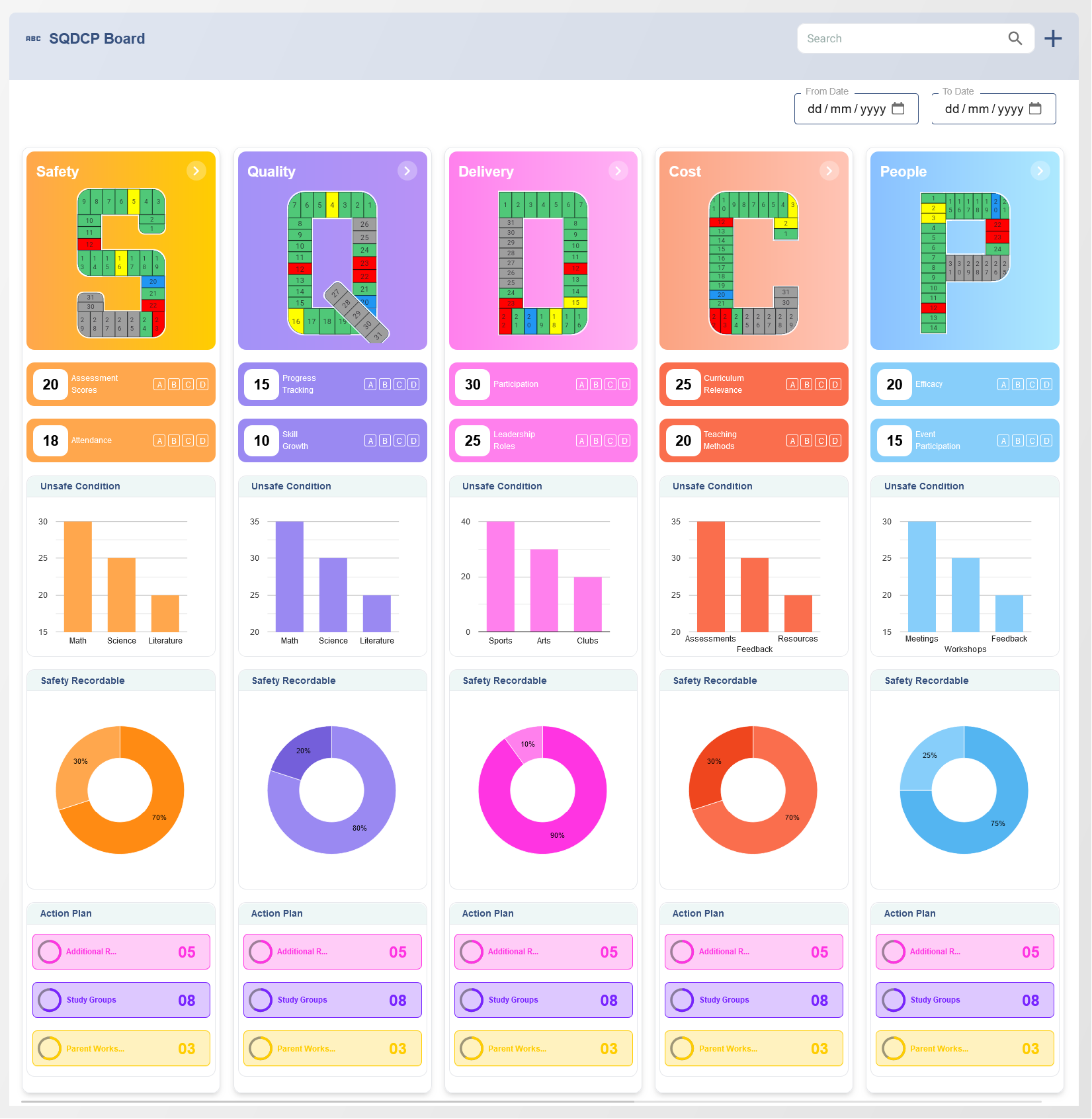
Various visual tools can be used in a balanced scorecard, such as dashboards, pie charts, bar graphs, heat maps, trend lines, and traffic light indicators. These tools help to visualize key performance indicators (KPIs) and provide an easy-to-understand representation of performance data.
How can dashboards improve understanding of balanced scorecard data?
Dashboards aggregate data from multiple sources and display it visually, allowing users to view real-time performance metrics. They help highlight trends, pinpoint issues, and track progress toward strategic objectives, improving decision-making and ensuring alignment with organizational goals.
What role do charts and graphs play in the balanced scorecard?
Charts and graphs play a key role in the balanced scorecard by presenting performance data in a visual format that is easy to interpret. These visuals help communicate complex information quickly, highlight patterns, and provide insights into whether strategic goals are being achieved.
How can visual insights help with decision-making in performance management?
Visual insights help decision-making in performance management by providing a clear view of key performance indicators (KPIs). With visual data, managers can identify areas of success or failure, enabling them to make data-driven decisions to optimize performance and address any challenges swiftly.
What are the benefits of using visual insights for monitoring strategic goals?
Using visual insights for monitoring strategic goals helps ensure that stakeholders can quickly assess progress, make adjustments when necessary, and stay aligned with the organization's long-term vision. It also fosters transparency and allows for easier communication of performance to teams and executives.
How does the balanced scorecard with visual insights help track performance over time?
The balanced scorecard with visual insights allows organizations to track performance over time by providing historical data through graphs and charts. This helps identify trends, measure progress toward long-term objectives, and evaluate the effectiveness of strategic initiatives.
How can KPIs be displayed visually in a balanced scorecard?
KPIs in a balanced scorecard can be displayed visually using various formats such as bar charts, line graphs, and gauge charts. These visuals allow for a quick assessment of how well the organization is performing against set targets and objectives.
What is the impact of visual insights on aligning teams with the balanced scorecard objectives?
Visual insights help align teams with balanced scorecard objectives by providing clear, easily accessible data on performance. Teams can see how their contributions directly impact organizational goals, which motivates collaboration and drives the achievement of strategic objectives.
Can visual insights be customized for specific business needs in the balanced scorecard?
Yes, visual insights can be customized to meet the specific needs of a business. Organizations can select relevant KPIs, design custom dashboards, and choose appropriate visual tools that reflect their unique business objectives and industry requirements.
How can real-time data be incorporated into balanced scorecard visual insights?
Real-time data can be incorporated into balanced scorecard visual insights by integrating performance tracking systems with the scorecard. This allows for live updates on key metrics, ensuring that decision-makers have the most current information to guide their actions.
How do visual insights assist with identifying areas for improvement in the balanced scorecard?
Visual insights assist with identifying areas for improvement by clearly displaying performance gaps. By using color-coded indicators or trend lines, managers can easily spot underperforming areas, allowing them to take corrective actions and optimize processes.
How can balanced scorecard visual insights support continuous improvement and strategy refinement?
Balanced scorecard visual insights support continuous improvement by providing ongoing feedback on performance. Regularly updated visuals highlight both strengths and weaknesses, enabling organizations to refine strategies, optimize workflows, and achieve continuous growth and improvement.